A referral page is a win-win situation for both the customer and your business. Delve in the following blog post to know more about creating a perfect referral page, step-by-step with appropriate examples.
From tips to promotion, we have got you covered:
Definition of a Customer Referral Page
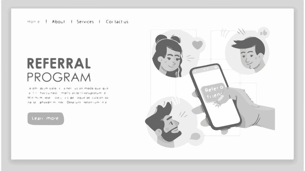
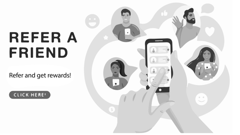
A referral page is a very first page that a consumer sees. Then this directs him to take action by offering some incentive. The incentive/reward could be a free item or some discount off an item, which they get after referring their family and friends.
Great content and attractive designs of the customer referral page attract most customers to take action for the incentive offer.
But, what is the need for an attractive customer referral page? Some people might think of it as absurd, but this is one of the best ways to increase the customer base.
Why create a referral page?
Customer referrals bring higher conversion rates.
About 83-90% of online respondents trust recommendations from their family, more than any online ad.
The business that has a referral page knows that people will come and get more referrals from their friends and family ad the same goes for the new users as well. The cycle thereby goes on. It helps to increase customer retention rates.
Finally, to add to your list of benefits is the cost-effectiveness of this method. All you need to pay for is just a talent to design and write the content for the page. The attractiveness of your page helps to let your customers know you are not spam.
Goals of a Referral Page
The main goal of these pages is to draw more customers to your business through the existing ones.
The psychology involved here is simple:
People need some proof from their trusted circle (friends and family) to consider a brand. If a friend/family member recommends some product or service, then people are likely to try it out than their likelihood of seeing your ad.
Moreover, you create a favor by giving incentives and offers that encourage them to spread the good word about you.
Perfect Customer Referral Page Anatomy
Now is the time to make a step-by-step perfect customer referral page.
Dive in:

1. A Great Headline
Words have the raw power of making a person reading the string of them feel a range of emotions, ranging from hatred and anger to bliss and love.
Thereby, you can use this fact to your advantage by putting up something emotion-stirring on your referral page.
After all, everyone firstly sees the
The attractiveness draws customers to see your whole scheme.
Some ideas to help in crafting a Great Headline
Use Power Words
Power words are words that trigger some emotional or psychological response. They could prove to be a great way to get the customers to notice what you are talking about and be ready to take up the referral program.
Some examples of such phrases could be like magic, free, and so on to make a powerful headline altogether.
Kiwi used the value of power word to attract people through:
Sweet and short
A good headline should be short yet understandable a the same time. Draw attention with smartly chosen words, not with exaggerated and unnecessary words.
Using numbers
Readers are instantly hooked with interest by the age-old tactic of using a number in the headlines.
Reward talks
Mention the reward. People who join you need to know their benefits as well to hop onto the referral scheme.
Following are how Murad helped people to understand the benefits through link sharing:
Making people feel good
It seems to be a good strategy if you are friendly with your visitors and tell them how their actions will affect them and other people because it makes people feel good about themselves and thereby it makes them more inclined to buy from you.
Use words like the following often:
→ Love
→ Friends
→ Reward
→ Family
→ Care
→ Help
→ Win
Minkoff does this through:
2. Explaining the Benefits
Now is time to mention the benefits.
Why should visitors confer with your referral program? What will they gain from it? Will they be offered something special?
To clear all such basic queries in their mind, you need to make sure that you explain the benefits properly:
No need to exaggerate the words
People have a small attention span. Keep in mind to give your best in making it simple yet smartly about the benefits you are providing. People should be drawn in, in the period of those 12 seconds for continuing to know more about your company.
Make it Informative
Make sure your content is informative yet short to make them understand.
3. Eye-Catching Image
Use images to engage your visitors in a better way. People are bound to process visual data more than any other type of data. So better to make your referral visually appealing.
Let the image show something that provokes an emotion from the customers. Let the power words be a complimentary item of the image you set up. In this way, the image will tell most of the story rather than words.
Following are some ideas to help you with designing an eye-catching image:
Have one main and impressive image
Also known as the hero shot, a full-size photo that captures the essence of your service or product. Make sure it settles well with what you provide as a service to the people.
You may add a text below or above depending upon your requirement but keep it short so that people are not visually distracted.
A good rule for the hero shot is letting 60% of the image showcase your service.
Your image has to be of high quality as it will decide the chances of your customers to share the product link with their family and friends. Avoid using copyright-free images.
Relevant image
Ask yourself if the image you are selecting is giving you the same idea that the customers would take or not. Rethink your hero shot.
Awesome Title
The image must be in the spotlight of the page. Add title only for intensifying the positive vibes the customer gets by looking at it.
4. Add a Low-Friction Form
Friction is the element that resists your customers from the CTA page. Hence give your customers something to explore when they arrive on your page and not leave them stuck there and do nothing.
Make it easier for the customers to refer friends to ensure a low friction landing page.
Let the form be as easy to fill up as possible else the customers will leave your page.
Let there be check-boxes and input boxes to avoid customer load of work.
The psychology behind all this is simplistic: people do things that they deem easy and leave the task if it takes too much time.
Tips to make a Low-Friction form:
A/B Testing
Resort to taking the A/B test for your landing page.
When it comes to the customer preference of styling the referral page, you can experiment with colors, visuals, words, and form fields as much you want. The one that fits the best is the best one for your referral page.
Let the form be as clear to the audience as possible for sign up to help increase the conversion rate.
White Spaces
Make sure they can see everything clearly, else either the customers will leave without doing anything or be left confused and hesitant about your referral program.
Bonobos do it like:
5. A Clear CTA
Add a clear CTA to convince your customers to share the word about it with their acquaintances.
Customers will likely quit your page unless you include a CTA to let them know what they have to do.
CTAs are all different. Some might be boring, while others might be powerful and attractive.
Create CTAs to appeal to the customers and convert.
Following are some ideas you can resort to for creating a strong CTA.

Use action words
Action words give customers a push to take action. They need to be on point and powerful enough for this purpose.
Examples are as follows:
→ Register now
→ Start sharing
→ Refer and earn
→ Share on Facebook
→ Share this sale and get $x
→ Share your referral link today
→ Start saving
→ Send email
Attention to Design
Designing an attractive CTA can play a crucial role for your customers to take action accordingly.
Here are some helpful tips for your rescue:
→ Use white space effectively enough to let the button stand out.
→ The CTA should be of contrasting color to find easily.
→ Frame button to increase contrast if required.
→ Make the CTA button big enough but not too overwhelming.
Easy to Find
Placing the CTA button is as important as its design. Make it easy to find so that things work out in your favor.
Rather than having customers scroll down to find the CTA button, let customers see it clearly on the top itself.
Also, you can add several CTA buttons if your landing page is very long.
6. FAQ section
FAQ sections can be a powerful marketing tool.
An easy way to resolve queries of customers is to add a FAQ section to save them time from having to contact and wait till you answer them back.
Visitors can get a clear explanation in bullet points through answers, thereby allowing you to explain without compromising with the CTA button space or the headline.
You can also keep a How It Works section instead of a FAQ section.
An example of Gabb Wireless:
Some ideas to aid you with Great FAQ Section
Know their queries
FAQs are what your customers ask the most that you help by creating questions and answering them accordingly.
To know, talk to the people who know your customers: sales and support.
Concise Answers
Answers to the queries should be explanatory in simple language rather than in big paragraphs and be limited to 100 words. Also, make sure to keep updating the FAQs section.vinar dapibus leo.
Text Display
Several ways to display answers include:
Expanding-answer:
The customer sees the questions and gets the answer by clicking on them.
Questions-only:
A separate page whenever a question is selected.
Questions and answers:
Questions and answers are on the same page.
New page:
CTA on one page leading to a new page for only FAQs and solutions.
Brand Voice
Brand Voice is the personality of the company that makes it unique from others.
Your business should have an authority of the subject for people to feel that they are talking to someone they already know. Understand their needs and requirements.
FAQs can be helpful in this case.
Promote Your Referral Page
Make sure that your referral page is easy to find and customers do not go off-site unnecessarily in finding the page.
Here are the best places to add a link to the referral page:
→ Homepage
→ Website menu/footer
→ Newsletter
→ Email marketing campaigns
→ Blog posts
→ Confirmation pages
Make it easier for the customers to share the good word. Add a link to all the possible social media platforms that your audience frequently visits to reach a mass audience all at once.
Email Marketing Campaigns
One of the simplest ways to promote your campaign is by sending out emails. A better idea is to consider sending scheduled email campaigns.
Send out emails to the customers who have not yet referred to anyone but come in the top tier of the potential people who could help bring referrals from their side.
You can let your customers know about it through a pop-up while they sign up or sign in to your platform to let them know about the referral program straight away.
Customer appreciation
For getting more personal, send out personalized emails to the referrer customers, thanking them for their referring volunteering at the right time.
CONCLUSION
An attractive referral page is a key to open through their heart and contentment.
The golden key to bring in new users.
Making a referral page is not easy and quick. You need to employ a good design, writing, and developing team to meet perfection.
We really hope that these tips helped you in your journey.
Good luck!


Enabling Social Sharing