How to Build a Sales Page that converts?
You’ve probably seen a sales page if you’ve ever purchased an online course, software, or high-ticket item. That likely prompted you to reach for your wallet. Some effective sales pages bring in millions of dollars for organizations, even though designing one is far more complicated than simply listing your product’s features.
From identifying the right page builder and setting up a funnel to copywriting advice and essential A/B tests, here’s a guide on how to make a killer sales page.
What is a sales page?
It accomplishes this by clearly explaining how your product or service solves and benefits their specific situation. While the definition of a sales page is simple, it takes a lot of time and effort to create a successful sales page. For example, you’ll need to conduct extensive consumer research to determine what underlying pain points customers are experiencing because of their problems.
Let’s imagine you operate a dating or coaching service for males. You might learn from customer research that they have underlying issues that go beyond simply finding a date. They may, for example, feel out of place in a bar and wish they could converse with ladies. Rather than just telling them what your product or service does (helping them find a date), it should also tell them how it will make them feel and address any underlying issues (feel confident in a bar).
Finally, a fantastic sales page should address all the reader’s concerns. “Well, that dating offer might work on 35-year-old guys, but it won’t work on someone who’s 45,” they would argue. Case studies and testimonials are also important components of sales pages since they can help customers connect with other people who have had success with your product or service. Finally, a smart sales page understands its customer so well that the offer it makes is compelling.
What is a sales page v/s a landing page or a homepage?
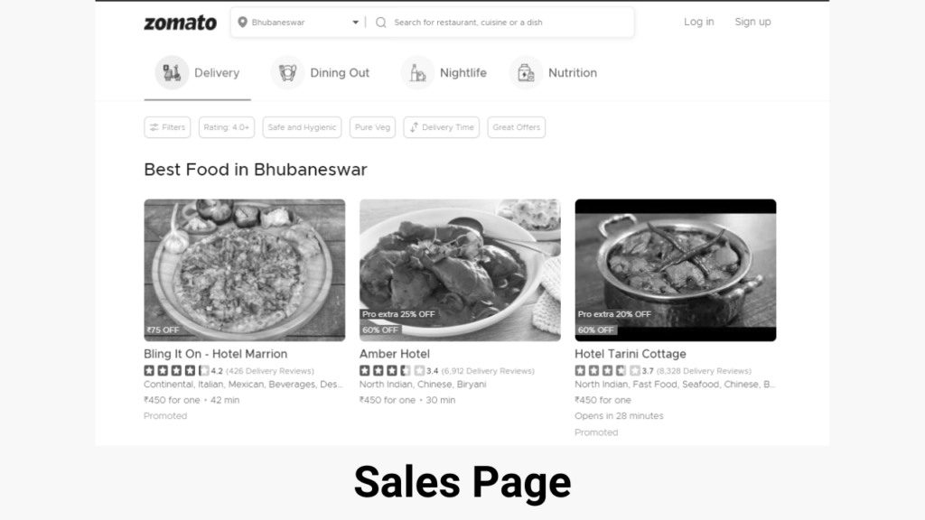
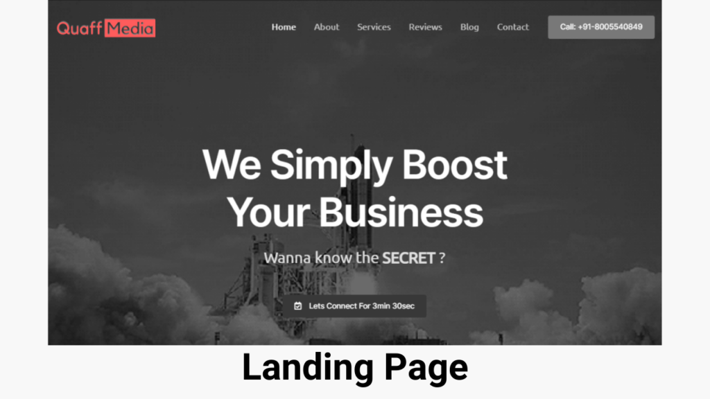
Briefly, a sales page is like a landing page but different from a homepage. Both a sales page and a landing page are designed to persuade consumers to act. While landing pages and short-form sales pages are nearly identical, long-form sales pages are more extensive than a standard landing page. Homepages, on the other hand, are different from sales pages.
This is because a homepage’s purpose isn’t solely to generate conversions. They appeal to a broader audience, and they aren’t as customized to converting a specific consumer as a sales page is, with navigational tabs and general wording.
Long sales page v/s short sales page
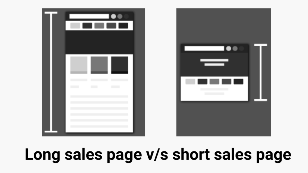
However, not all sales pages are created equal. Some are brief, requiring only a few hundred words, while others are lengthy, requiring several thousand words. What criteria do you use to determine which format is appropriate for your company?
Both have their perks and disadvantages. Long-form sales pages, for example, are great because they allow you to:
- Establish a solid relationship with the reader by demonstrating that you are aware of and understand their concerns.
- Demonstrate your product’s benefits, delve into underlying pain concerns, and respond to criticisms.
Long-form sales pages, on the other hand, have drawbacks in that some consumers will not read the full page, and the main value and CTA of a basic product will be quickly forgotten. You might also miss out on some impulse purchases.
As a result, short-form sales pages have the advantage of allowing you to:
- If the reader is in a rush, quickly express the product’s value.
- Provide a succinct summary that may be readily shared with friends and coworkers.
Finally, the type of sales page you develop will be determined by the offer you have.
In general, a shorter landing page is best for a product or service that:
- Simple/self-explanatory
- Costs are relatively modest.
- Time commitment is minimal.
A long-form landing page is best suited for a product or service that:
- Complex
- Cost is relatively expensive.
- Continual dedication/time investment
While there are some criteria, deciding whether to construct a long-form or short-form sales page isn’t always straightforward. Consider how long it would take you to sell your product in person if you were stranded. A short form sales page is typically the best option if you only need to offer your prospect a fast demo or sample, but a long-form sales page is the best option if you think your product or service will require an extensive dialogue and relationship with the buyer.
How to create a sales page?
To establish a sales page, most people use email, social media ads, Google AdWords, or a website to generate traffic to it. As a result, you’ll need to host your sales page on a post-click landing page program. Fortunately, there are a few solutions for landing page software that is simple to use and do not require any coding skills.
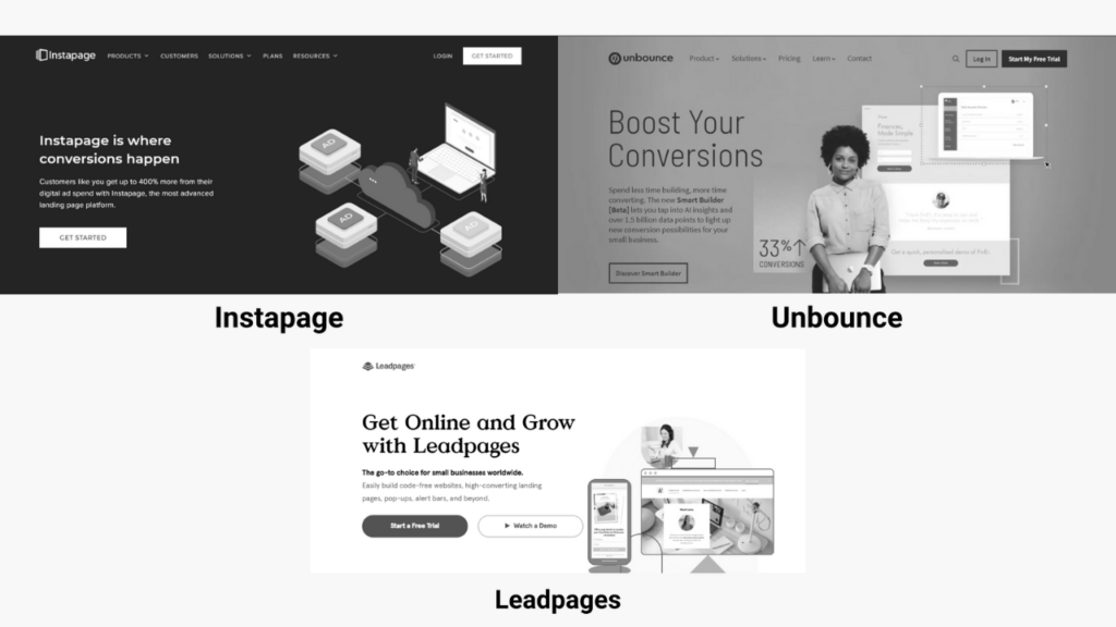
Instapage
Because it’s essentially the Apple of landing pages, Instapage is a popular choice for individuals obsessed with design. There are over 200 attractive themes to select from, no traffic restrictions, built-in analytics, and even dynamic text substitution for PPC ads.
The disadvantages of Instapage include the lack of A/B testing on the basic plan (which, as you’ll see, is critical for any sales page) and the fact that it’s the most expensive tool on the market. As a result, Instapage is typically the best choice for larger brands and more experienced marketers.
Unbounce
Unbounce is a touch less expensive than Instapage, at $80 a month, and all its plans include an automated testing tool. It also contains an analytics suite and over 200 distinct templates to choose from, all of which can be customized using the drag-and-drop editor.
Unbounce’s disadvantage is that you can only publish a certain amount of pages at a time, and you can only use one lead capture form on each page. Its user interface isn’t quite as polished as Instapage’s, but it’s still serviceable.
Leadpages
Leadpage’s every plan includes an easy-to-use drag-and-drop editor, as well as unlimited pages, traffic, and leads.
They also include several extra features, such as countdown timers and progress widgets, to aid conversions. Lead links, another unique Leadpages feature, allows customers to sign up for an online seminar or event directly from their inbox.
The most significant disadvantage of Leadpages is the user experience. The editor can be problematic at times and does not always save work correctly. The basic plan, on the other hand, starts at just $25 per month, so it’s still a terrific price.
Key elements of sales pages
Most sales pages have roughly the same core parts, regardless of the product or service you’re offering.
Strong headline
A great headline is the first and perhaps most critical part of your sales page. Without a compelling headline, the rest of your sales page will be meaningless because no one will read it. The key to writing an effective headline is to mention something that speaks to your audience’s main concerns. Perhaps the most crucial component of your offer is the headline. You can try personalization, urgency, mystery, and other headline strategies, for example. Keep in mind that headlines will likely perform differently with different audiences while you’re testing them.
Pain point
The next step is to confirm the customer’s complaint right away.
Depending on whether you choose a long-form or short-form sales page, the implementation will differ, but the concept will be the same. If you opt to create a short-form sales page, you may want to use a more particular tagline or subhead. You don’t need a lengthy story on a brief sales page. The tagline should address the problem. If you have a long sales page, though, you can tell a story about how you dealt with a similar problem.
To establish the pain point you want people to identify with, do the following:
- Mention any underlying issues (such as being “forgettable”).
- Include detailed instances (standing in the corner checking email)
- Empathize (“I’d say the wrong thing at the wrong time…”)
Benefits
Now that you’ve established the pain point and gotten your audience to nod, it’s time to demonstrate how you overcame the difficulty and prove it with the benefits they’ll receive. Don’t just provide a generic offer, describe the advantages and worth of each part of your offer. If you have a brief sales page, you may simply describe the important benefits to the person by using basic bullets in the CTA.
Testimonials
Unfortunately, if you’re the only one who thinks your product or service works, no one will care. As a result, seek out others for testimonials. If this is your first launch, ask some folks if they would be willing to beta test the product and leave a testimonial.
If you don’t have a network, you can ask your list to join in a beta test in Facebook groups, Slack groups, or even by cold emailing them. When soliciting testimonials, go beyond the usual questions and inquire about how it impacted their lives or businesses.
Proof
Use any data that your product has, such as screenshots from Analytics, bank statements, or other dashboards.
Screenshots of remarks in your community can also be used as proof. Make certain, however, that any testimonials or proof you present are genuine and not fabricated.
Answer FAQs
Answer objections and FAQs as you near the end of your sales page, as this is critical to increasing conversions. Begin by conducting customer research to determine the most prevalent objections. You’ll probably lose out on a lot of possibilities if you just guess. As a result, if you have a sales team, ask them what the most typical objections are and what types of solutions consumers are looking for.
You can also check through emails or call your customers to inquire about their reservations before making a purchase. Do market research if you don’t have any clients or consumers yet. Even if you don’t have any clients, ask folks in your target market whether they’d be willing to talk to you on the phone about these difficulties. You can accomplish this by reaching out to folks in Facebook groups, Slack groups, and even local meetups.
Then include these objections into your copy.
CTA
The only thing left is to add a CTA to the end of the offer. CTAs should ideally be placed across your sales page, with the one at the bottom being the most prominent.
Make sure you include the following in your CTA to make it more effective:
- A timer with a countdown
- A risk-free, money-back guarantee
- Any monthly payment plan is available.
- One more time, the core value proposition
- Any additional benefits
A/B Testing a sales page
Now that you’ve established a sales page, keep an eye on how visitors interact with it, and A/B test different sections of it.
Begin by gathering information. Add a heatmap to your landing page, for example, to track how far people scroll. If there’s a particular region where visitors stop scrolling, investigate it and experiment with an alternate copy to see if you can reduce bounces. You can also put your traffic creation techniques to the test. Test diverse audiences if you’re utilizing Facebook advertisements to drive traffic.
Turn off the advertisements that bring in the lowest ROI and invest more in the ones that are working well if you’re running various advertising from Google, Facebook, and affiliate pages. Pricing, CTAs, testimonials, and other elements may all be tested. Make use of the A/B testing features included with landing page builders.
Start creating now
Instead, the best way to develop is through practice and experience, so get started on your first sales page right away.
Once you’ve begun receiving traffic, experiment with different elements and don’t give up. Copy hacks, traffic generating methods, and more will turn your sales pages into conversion machines over time, so get started!

